The 92 features that make iOS 10 a fine, free upgrade
Hey, guess what? You can upgrade your iPhone to iOS 10 today! 92 new features, yours free!
(Free, that is, if you have an iPhone or iPad that can run it. That would be the iPhone 5 or later, 2012 iPad or later, 2013 iPad Mini or later, or the 2015 iPod Touch. To perform the upgrade, open Settings -> General -> Software Update once the red “1” badge appears on it. And no, it won’t brick your phone; Apple fixed that glitch within an hour.)
If you’re in a hurry, here’s the busy-person summary of iOS 10:
There are two big-ticket items. First, there’s been a colossal revamp of Messages, Apple’s text-messaging app. Now you can dress up your messages with a wide range of hilarious new visual treats and animations and effects, inspired by the ones in, for example, Snapchat and Facebook Messenger.
Second, Apple (APPL) has brilliantly rethought that moment when you pick up the phone—a hundred times a day. The iPhone now requires fewer steps to unlock, check the latest alerts, or fire up the camera.
Of course, iOS 10 also includes dozens of small tweaks, redesigns, and enhancements—not all of them coherent. In any case: Here’s a huge, complete guide to what’s new, with my assessment of how much impact each change will have on your life, on a scale from 0 to 5.
The unlock experience
In iOS 10, Apple has turned the iPhone into something that’s super useful even before you’ve unlocked it or even tapped it. You can now gain a wealth of information just by lifting it.
A new option in Settings called “Raise to wake” (available on the 6S, 7, and SE families) makes the screen turn on when you just pick up the phone. (Actually, it turns on briefly often, when it’s in your pocket or when you’re walking along with the phone in hand. That side effect doesn’t cost you much in battery power but might bug you.)
So who cares? You will, when you consider the second big change. The usual Unlock screen, showing the time and all your missed calls and texts, is now only the centerpiece of three screens. To the left: a customizable screen full of widgets like news, weather, reminders, your calendar for the day, and so on.

This widgets list is customizable and expandable; almost any app can add a bubble to it. Every bubble can appear either in a space-saving collapsed incarnation or, when you tap Show More, an expended one. The whole thing has been merged with the old Spotlight search bar and Spotlight “you might want to open this app now” feature, and redesigned for better clarity and visual space.
And to the right of the central unlock screen: The camera mode.
Taken together, this means that you can take a picture really fast: Pick up the phone and swipe left. You’ve saved one step and gained a much bigger target for your “swipe to open the camera” (the entire screen, rather than a tiny camera icon).
This also means that you can check your calendar by picking up the phone and swiping to the right. On busy days, I use that technique absurdly often. (I’ve customized the widget screen so that Calendar is at the top.)
A lot of the work you’ll do on your phone will now never require unlocking it at all. You can answer your texts and emails right from the notifications, still without unlocking your phone. You can have a whole Messages conversation, right there from the notification bubble.
But what if you do want to unlock it? Since 2007, the technique to unlock the phone was swiping to the right across the Unlock screen—a safeguard to prevent the phone from turning on accidentally in your pocket. Now, for the first time, you can unlock it instead by clicking the Home button.
If you’re already using the fingerprint reader for security, this feature makes worlds of sense. Now, you can unlock the phone without ever moving your thumb off the Home button. One step instead of two.
And “Press Home to unlock” means that it’s possible to unlock your phone (authenticate with your fingerprint) without going to the Home screen. That’s handy, because some operations require authentication (like deleting an email, or reading a text if you’ve chosen not to display the body of incoming texts)—but you don’t really want to unlock the phone to perform them.

(Of course, you can turn off these new features if you’re worried about interlopers picking up your phone when you’re not looking.)
Impact: 5
Messages
Whoa.
Apple, wary of losing customers to creative messaging apps like What’s App, Google’s Allo, and Facebook Messenger, has radically overhauled its built-in Messages app. Its special effects and cool interactions easily match most offerings of rival apps—and, thanks to a new Messages app store, even surpasses them. There are so many creative ways to express yourself now that “Oh, sorry—you must not have picked up on my tone over texting” will no longer cut it as an excuse.
For example:
Now you can draw on a photo with a finger. (To open the markup options, tap the photo before sending.)

You can drag a “sticker” (an animated or still icon) anywhere onto any message you’ve sent. The Messages app store gives access to endless sets of free or for-purchase stickers.

Messages contains a searchable “drawer” full of animated reaction GIFs. Now you, too, can respond to something someone says with a two-second loop of Kevin Spacey slow-clapping.
If you hard-press (or long-press) the blue Send arrow, you get a palette of four new sending styles. The first three—Slam, Loud, and Gentle—animate the typography of your text to make it bang down, swell up, and so on. For example, Slam (below, left) makes your text fly across the screen and then thud into the ground, making a shockwave ripple through the other messages.
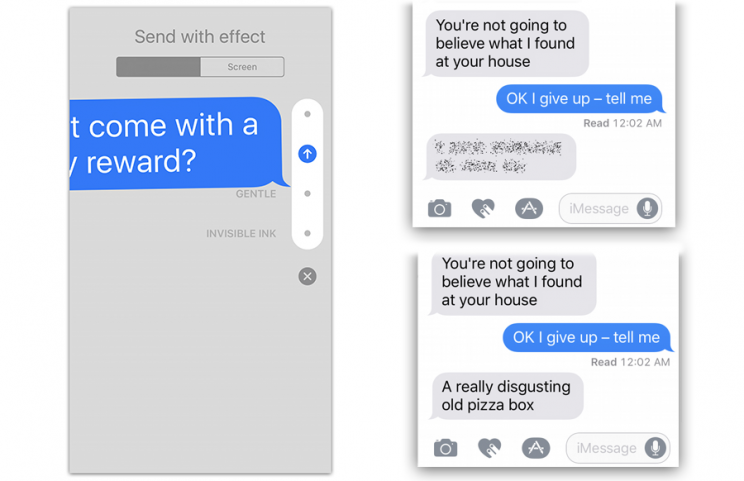
The fourth special “Send with effect” is called Invisible Ink (above, right). It obscures your message with animated glitter dust until your recipient drags a finger across it. This idea is great for guessing games and revealing dramatic news, of course. But when you’re sending, ahem, spicy text messages, it also prevents embarrassment if the recipient’s phone is lying in public view.
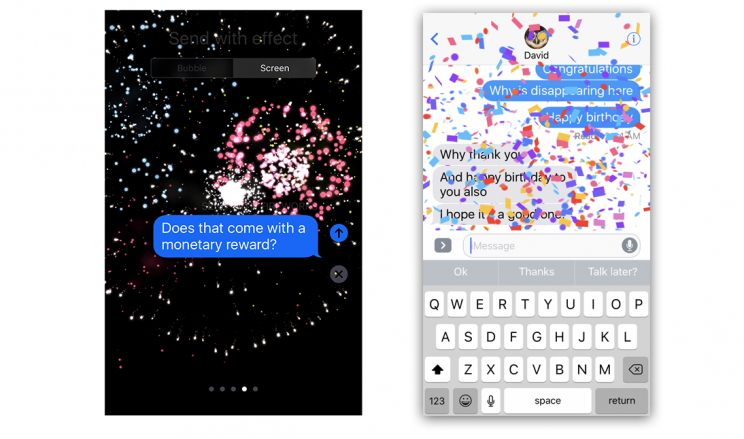
If you hard-press (or long-press) the blue Send arrow, the fifth option is Screen. It opens a palette of full-screen animations, which fill the entire background of the Messages window to indicate your reaction to something—fireworks or falling confetti, for example. (If your text says “congrats,” “happy birthday,” or “happy New Year,” Messages fills the screen with a corresponding animation automatically. Which may or may not get old fast.) (NOTE: The menu of animations from the blue Send arrow does not open if, in Settings, you’ve turned on Accessibility -> Reduce Motion. Bizarre.)
If you turn the phone 90 degrees, the screen becomes a whiteboard; what you scribble with your finger looks and feels like real ink on paper and gets sent as a graphic. Just so cool.

If someone pastes a web link, you see an actual thumbnail image of the resulting website instead of just the typed web address. And if you paste a link to a video on YouTube or Vimeo, your correspondent can play the video without leaving the Messages window.
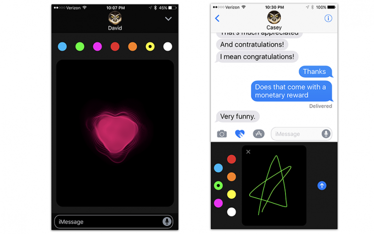
The Heart icon opens a palette of crazy interactive art features, mostly inherited from the Apple Watch. One lets you draw on a photo that you choose, defacing it for expressive purposes; in fact, you can even draw on a video as you’re recording it. Another lets you doodle with your finger in a color of your choice. In both of those cases, your recipients see the doodle “played back” on their screens, re-created line by line as you drew it. You can send an animated heart, broken heart, fireball, or kiss. (You can do those on top of a video that you record, too.)
Taking a new photo or video to send is quicker and easier now—Apple has removed one layer of superfluous dialog box when you tap the Insert button.

When you send one or two emoji symbols as your entire response, they appear three times as large as normal.
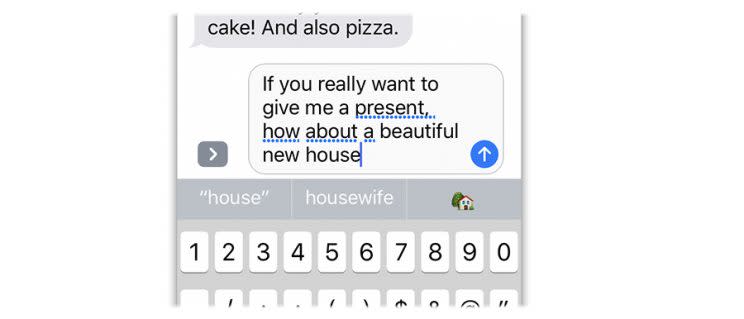
If you double-tap the Emoji button on your keyboard, iOS 10 highlights any word in your freshly typed (but not yet sent) message that can be replaced with an emoji symbol. Tap any highlighted word to swap in the icon. That’ll be a huge time saver—you’re spared the ritual of scrolling through hundreds of tiny symbols to find the one you want.

As you type, the standard row of three predictions for the word you’re typing now includes emoji suggestions, like this:
If you double-tap a message you’ve been sent, you’re offered a Tapback palette: six little reaction symbols like the ones in Facebook’s Like palette. You can use them to stamp your reaction onto the other person’s text. (You can even change your stamp later in the chat, should your reaction change when you get new information.)

(Getting the idea that emoji are a big deal in iOS 10? You’re right. The set that Apple offers is bigger—and more demographically diverse—than ever. And, with some controversy, Apple has replaced the handgun icon with a water pistol.)
And a few more Messages upgrades:
Apple has also opened up Messages to other app companies; yes, there’s an app store just for messages. There are already apps that let you pay somebody over Messages, or view podcasts, weather, movie listings, trip plans, and other functions, right in Messages. The mind reels.
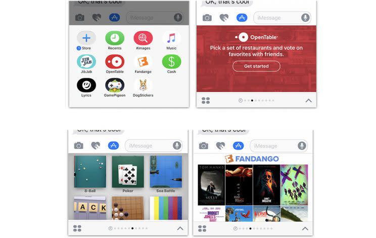
And you know the three guesses about the next word you’re going to type (that appear above the keyboard)? Now, those suggestions include information you might want to type. If you type “I’m available at,” one of the suggestion buttons will include the next open slot on your calendar. If you say “Pogue’s number is,” the button will offer my phone number (if I’m in your Contacts). If someone asks “where are you?”, one of the buttons offers to drop a Map button.

In Settings -> Messages, you can opt to send lower-resolution photos. Why eat up your monthly cellular data allotment sending photos that are too big for your phone friends’ screens to show anyway?
Finally, you can now turn off Read Receipts (the indicator to the other person that you’ve read his or her texts) on a conversation-by-conversation basis, rather than turning it on or off for the entire app. (Tap the person’s name at the top of the screen to see the option.)
Clearly, this is a lot of stuff to cram into a tiny messaging-app screen, and you’re to be forgiven if you find it overwhelming, cluttery, and difficult to learn. It kind of is. No longer will the standard Messages screen look like a tidily typed screenplay.
But the white-hot popularity of rival messaging apps have clearly told Apple that this is what the people want.
The young people, anyway.
You might well ask: What happens if I send one of these fancy animated goodies to somebody who doesn’t have iOS 10? Or even has… [shudder]…an Android phone?
In most cases, the recipient gets a still image instead of the full animation. The bubble effects and full-screen effects don’t go through to Android people at all; if you have an earlier iOS version, you get a text message that tells you what you’re missing—for example, “sent with confetti” (for full-screen effects) or “Liked the message” (for tapbacks).
Impact: 5
Control center
For years now, you’ve been able to swipe upward from the bottom of the screen—any time, in any app—to see the Control Center. It’s a single quick-access panel containing the most important switches, like Airplane Mode, WiFi on/off, Bluetooth on/off, and the flashlight.
In iOS 10, the music-playback controls sit on a second Control Center screen, to the right of the first. Unfortunately, it’s too easy to switch to that panel accidentally when you’re dragging your finger on the Brightness slider. And if you don’t know that the second panel is there, you might wonder what the heck happened to those music controls.
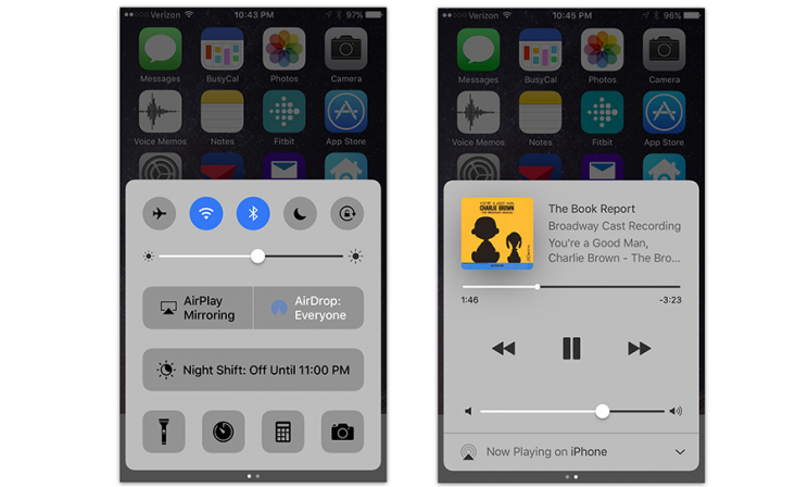
(In the unlikely event that you have any HomeKit home-automation gadgets at your house, a third Control Center panel appears, so that you can control them.)
The Control Center buttons now have colorful buttons when they’re turned on, which is far clearer than “black = on, white = off,” or whatever it used to be.
Also, you can hard-press or long-press the buttons at the bottom of the Control Center to get shortcut menus of useful settings. For example, the Flashlight button now offers Low, Medium, or High brightness! That’s super cool, especially on the iPhone 7, whose much stronger LED flashlight is enough to light up a high-school football game at night.

The Timer button offers presets for 1 minute, 5 minutes, 20 minutes, and so on. The Camera button offers Take Photo, Record Slo-mo, Record Video, and Take Selfie. That kind of thing.
Impact: 3
Siri is more open
Until now, only Apple decided what Siri, the voice-controlled assistant, can understand. Now, though, the creators of certain apps can teach Siri new vocabulary, too. Already, you can say, “Send Nicki a message with WeChat,” “Pay dad 20 dollars with Square Cash,” and “Book a ride with Lyft.”
Unfortunately, the only kinds of apps Apple permits to tap into Siri are in these six categories: audio or video calls, messages, payments, photo searching, booking rides, and starting workouts.
Notably absent: music apps. You still can’t say “Play some Dave Brubeck on Spotify,” as you can on Amazon’s Alexa. Apple Music is the only music service Siri understands.
Impact: 2, at least until Apple opens up Siri to more kinds of apps.
Redesigned Apple Music
Apple Music—the app, the $10-a-month service—was a hot mess. The newly redesigned app is far easier to navigate.

With one huge exception: You now see all the buttons and tabs for the Apple Music service even if you don’t subscribe to it! (In the previous version, all that junk disappeared if all you wanted to do was manage your own music.)
The new Apple Music app shows you the lyrics for some songs, which is cool.
Impact: 1, unless you’re a subscriber (and then 4).
Photos app
The redesigned Photos can auto-generate lovely, musical videos, using your photos and videos as its raw material (from a recent time period, or a recent place you visited, or featuring a certain person). It comes with a selection of 80 soundtracks, and plenty of customization controls. It’s a joy to reminisce through these animated slideshows.

Photos’s Search box lets you find images according to what they show. You can search your photos for “dog,” or “beach,” or whatever. You can’t type anything you want—you have to choose a noun from one of Apple’s canned categories—but you can combine a noun search with, for example, a place search, making it much easier to find a certain photo.
Well, at least when the gods are smiling. Apple’s image recognition software makes a lot of mistakes.
Photos also auto-groups the people in your photos, using facial recognition—for example, all pictures of your mom appear in a clump.
Some of these features don’t work until iOS 10 has analyzed your photos, which can take at least a day (during which the phone has to be plugged into power).
Apple proudly points out that all of this analysis is done on your phone. (That’s in contrast to services like Google Photos, which offers similar features but requires that Google accesses your photo library.)
Perhaps more usefully, the editing mode now includes a markup feature: You can draw or type onto your photos, or add a circular magnified area (ideal for highlighting the suspect entering the convenience store).
Impact: 3
A whole lotta misc
The world really needs a complete list of the new iOS 10 features, even if some of them are tiny nips and tucks. So here, for your consideration, are some of the other surprises that await you.
Cosmetic touches. Apple has done a lot of work updating iOS 10’s color and layout schemes. Things are cleaner. Things are easier to spot. Especially when it comes to notifications and widgets. Impact: 4.
Emergency Bypass. This switch, new on each person’s Contacts card, means “Let ringtones and vibrations play when this person calls, even when Do Not Disturb is turned on.” A million parents will now get better sleep at night. Excellent. Impact: 5
Recent searches. When you tap Search in Notes, Mail, and Messages, you see a list of previous searches you’ve conducted, to save you a little time. Impact: 1
Remember my parked car. Maps automatically drops a pin at the spot when you phone disconnects from your car’s Bluetooth system (or CarPlay system, if you have that). Later, it can guide you back. Impact: 4.
More 3D Touch features. If you have a phone whose screen responds to pressure (iPhone 6S and 7 families), you’ll find more of those shortcut menus available in more places. For example, you can reply to a text-message notification, accept a Calendar invitation, or see where your Uber is on a map, all by hard-pressing. If you hard-press a Home-screen folder, there’s now a Rename command. And if you hard-press in the Notification Center (the list that appears when you swipe down from the top of the screen) you finally get a Clear All Notifications command. Unfortunately, there’s no visual clue as to whether some icon offers a 3D Touch menu; you have to learn by trial and error. Impact: 2
Delete the bloatware. For the first time, you can hide Apple’s starter apps on your Home screens (Watch, Home, Stocks, etc.), so you’re not saddled with the icons you never use. You can “delete” them just as you would any app: Hold your finger down on one until the icons start wiggling, and then tap the X button. (You’re not actually deleting them—only hiding them. They still occupy 150 megabytes.) Impact: 4
Donate your organs. The Health app now offers you a chance to sign up for the National Donate Life Registry, so that you can do some good even after your death. Impact: Pretty big, if you save a life.
Multilingual typing. You can now type in two languages within the same text box without switching keyboard layouts. iOS figures out what language you’ve switched to and automatically changes the language for autocorrect entries and QuickType predictions. Impact if you’re a polyglot: 5.
Internet calls treated as phone calls. Apps like Skype, Facebook Messenger, Slack, and WhatsApp let you place voice calls, phone to phone, over the internet (instead of using the cellular network). For the first time, those calls are now treated by the iPhone exactly like regular phone calls. They appear in your Recents and Favorites list, they pop up the photo of the caller, and your Contacts list now has a place to save your friends’ internet calling handles. Impact: 3
Voicemail transcription. The Voicemail list now includes approximate transcriptions of the messages people have left for you, just as Google Voice has had for years! They’re very rough and filled with mistakes, but it’s usually enough to get the gist of a message’s topic and importance. Impact: 5

Bedtime-consistency management. Medical research tells us that sleep deprivation—and inconsistent sleep schedules—takes a terrible toll on our health, mood, and productivity. So iOS 10’s Clock app offers a new Bedtime tab. You answer a few questions about your sleep habits, and the app will attempt to keep your sleep regular—prompting you when it’s time to get ready for bed, waking you at a consistent time, and keeping a graph of your sleep consistency.

Split View on iPad. On Apple’s tablet, you can now view two Safari browser windows side-by-side. Impact: 3
Delete rarely played songs. If you turn on Optimize Music Storage in Settings, then, as your phone begins to run out of storage space, iOS 10 automatically identifies music you haven’t listened to recently. It removes them from your phone to save space. (Of course, you can always re-download them at no charge.) Impact: 2
Upgraded Maps app. Apple’s Maps app still doesn’t know as much about the world as Google Maps; it just doesn’t have the intelligence. Instead, Apple has put its efforts into slicking up the app itself. It looks great, and it now offers to reroute you if traffic will mar your planned commute. And now, app makers can add Maps Extensions—new features for Maps, like the ability to book a restaurant reservation with OpenTable or call an Uber ride. Impact: 1
Upgraded News app. The new app offers breaking-news alerts, subscriptions to certain publications, and a lovely new design. Impact: 1
New home-automation app. This app, Home, lets you control your thermostat, electric drapes, lights, and other home-automation gadgets—assuming that they’re compatible with Apple’s HomeKit standard. (You probably don’t own any.) Impact: 0
Collaborative Notes. You and your buddies can edit a page in Notes simultaneously. Great when you and your spouse are planning a dinner party and brainstorming about guests and the dinner menu, for example. Just tap the new round +person button at the top of the screen and send the invite by message, email, or whatever. The live editing isn’t as animated as it is in Google Docs—you don’t see letter-by-letter typing—but it updates soon enough. Impact: 5

Saving time making appointments. If you start to type a Calendar event that the app recognizes as something you’ve entered before, it proposes auto-completing it. Calendar also sometimes pre-fills in times and places as you create an appointment, based on information it spotted in an email or message. Impact: 3
Health sharing. You can now share your activity and calorie burn with your friends. It’s fitness through humiliation. Impact: 1
Instant unsubscribe. The Mail app occasionally offers an Unsubscribe button when it suspects that a message has come from a mailing list. Tap it, confirm your choice, and marvel that Mail has sent an Unsubscribe message for you. Impact: 4
Chronological Mail threads. In Mail, conversation view (where exchange messages are grouped) now places messages chronologically—no more scrolling to the bottom to see what everyone’s talking about. You’ll see. It’s good. Impact: 3
Expanded Lookup. When you double-tap a highlighted word and then tap Look Up, you now get a lot more than the dictionary definition. You now get matching Wikipedia entries, movie names, book titles, websites, news headlines, maps, and so on. In essence, Look Up becomes an instantaneous reference feature that saves you a trip to Safari’s search bar. Impact: 4
Live Photo updates. If you’re a fan of Live Photos—Apple’s name for the weird three-second-video+photo feature available on the iPhone 6s and 7 families—you’ll be happy to hear that iOS 10 brings image stabilization and to them. You can also apply the usual Photos editing tools (tweak color, brightness, contrast, and so on) to the video. Impact: 1.
Music continues in Camera mode. Opening the Camera app no longer pauses whatever music is playing. Fashion photographers who play rock music during photo shoots are celebrating everywhere. Impact: 2.
Apple Pay on websites. Website creators can now offer an Apple Pay button, meaning you can pay for stuff without having to painstakingly type in your name, address, and credit-card information 400 times a year. So cool: You can authenticate with your phone’s fingerprint reader! Too soon to say how many Web sites will offer this feature (it doesn’t go live until Sept. 20). Impact: 0.
Better autofill in Safari. Now Safari can fill in a secondary address for you in a web form (like your work address), or even someone else’s address (grabbed from Contacts). Impact: 3
More informative WiFi listings. Now, in Settings -> Wifi, you’ll find out if the WiFi network has no internet connection (“No Internet Connection” in orange letters appears). And if you’re connecting to an open network (no password), you get a “Security Recommendation” link. Tap it, and a message announces: “Open networks provide no security and expose all network traffic.” In other words, take caution, because your internet traffic is sniffable by the bad guys. Impact: 3.
New magnifier. The Accessibility settings offers a new magnifying screen that lets you control the zoom, color tint, and flashlight all at once—great when you’re having trouble reading fine print in a dark restaurant, or tiny black-on-gray print anywhere. You can set up your phone so that triple-clicking the Home button starts this mode. Impact: 4.
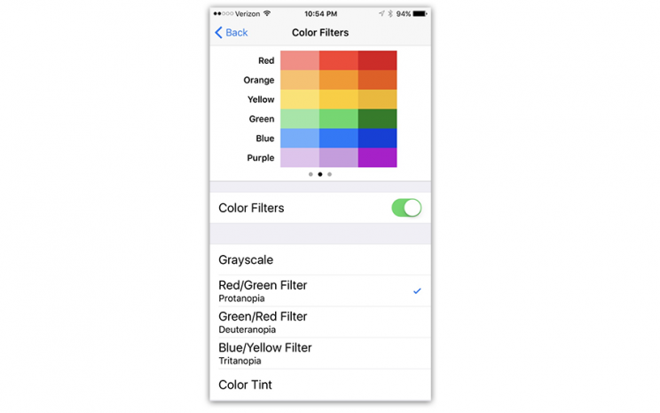
Color blindness filter. Also in Accessibility: A feature called Display Accommodations, which adjusts the phone’s screen to help color-blind people. It tells the iPhone’s screen to substitute different, easier-to-see colors for the red and green tones that typically trip up color-blinders (like me). (Incredibly, turning this feature on suddenly let me see all of the hidden numbers in the famous Ishihara dot-pattern tests online! At least in the tests where I couldn’t see them before. In other dot patterns, it made the numbers disappear for me…) Impact: 5, but maybe that’s just me.
What it all means
Let’s be honest: The simplicity that Steve Jobs once stood for, the courage to say “no” to new features, is long gone at Apple. Today, Apple adds just about every feature that seems to be finding traction among its rivals, and many more.
iOS has become a very dense OS, with more features than you could master in years. I mean, good grief—this review covers only the new features in iOS 10, and it’s 4,300 words long!
Then again, the public may not care about simplicity the way it once did. When smartphones were new, extreme simplicity was critical to helping them accept the concept.
Today’s 9-year-olds weren’t even alive before there were iPhones. And people who got their first smartphones as teenagers grew up along with iOS and Android—evolved along with them—so the sheer complexity doesn’t bother them much. It’s usually only their parents who complain.
But never mind. Despite the creeping featuritis, you should install iOS 10. It’s better, smarter, faster, clearer, and more refined than iOS 9. It takes hundreds of steps forward, and only a couple of tiny steps back.
And look at the bright side: By the time iOS 11 comes along next year, this operating system will seem like the simple one.
David Pogue is the founder of Yahoo Tech; here’s how to get his columns by email. On the Web, he’s davidpogue.com. On Twitter, he’s @pogue. On email, he’s [email protected]. He welcomes non-toxic comments in the Comments below.