The Apple Watch 2 is faster, waterproof—and more overloaded than ever
The first Fiat 122, which came out in 1962, had a famously tiny fuel tank. The car could drive only five miles between fill-ups.
Remember what Fiat did to make things better? They added windshield wipers and reclining seats!
OK, I made all of that up. It’s a metaphor—for the Apple Watch.
It’s the best-selling smartwatch, but that’s not saying much. Apple (AAPL) won’t even reveal how many people have bought them. That’s a strange behavior, in Apple’s playbook.
If you ask someone whose wrist is not graced by an Apple Watch—and that’s most people—why they haven’t taken the plunge, they usually offer one of two responses.
First, there’s the battery life. Good heavens: 18 hours! This is a watch you have to take off and charge every night, as though it’s a phone or a laptop. It’s like having to charge your shoelaces every night, or your hat.
Second, there’s the Why. Why do you need a smartwatch? Is it such a burden to glance at your phone to see your text messages? Where’s the killer app?
Apple has had 18 months to ponder these challenges—and now, at last, we can see the fruits of its efforts. Welcome to the Apple Watch Series 2.
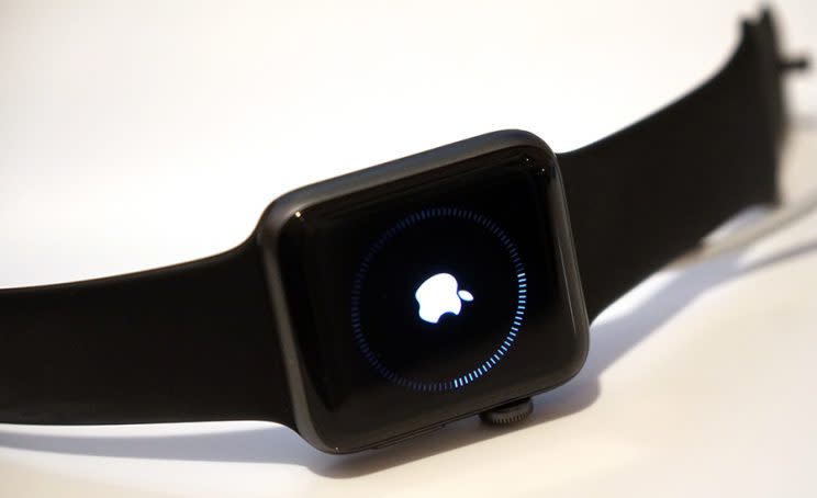
It costs $370 to $1500, depending on the materials you want for the case and the band. The actual electronics—the features—are identical across all those models. (Except for the Nike model. It adds two new watch faces and a plastic band with little holes in it. Somebody pinch me.)
So: Has Apple addressed the battery life? Has it addressed the Why?
Nope.
What’s new in Series 2
Physically, the new watch looks identical to the first one. It’s no slimmer. In fact, it’s a millimeter thicker than the original, which was no wafer to begin with.
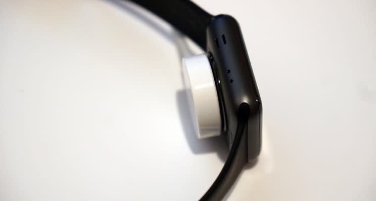
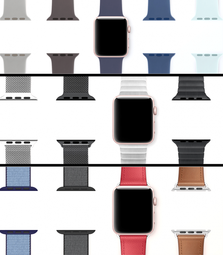
As before, part of the fun is picking out the watchband you want, out of the dozens of colors, materials, and clasp mechanisms. They attach and detach easily.
As before, an Apple Watch is worthless unless you also own an iPhone. It’s an accessory to the iPhone. For a crash course in what the Apple Watch is and does, I recommend my review of the original, here.
What’s new, though, are these features:
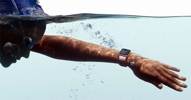
Waterproof. We’re talking really waterproof. It’s fine to swim with it, shower, even scuba dive, down to 164 feet. The activity tracker can now count your laps and your strokes, just as it tracks your steps on land. Everybody’s favorite feature: When you get out of the water, the Watch ejects water from its tiny speaker hole by playing a few long beeps.
Faster. You spend less time waiting for apps to open.
Brighter. The screen doesn’t bleach out in sunlight. It’s really, really bright—twice as bright.
Built-in GPS. Now you can run, walk, or bike without having to bring your phone. When you get back, you get to see your distance and route on a map. The fine print, though, is that GPS (on any device) guzzles battery power like a thirsty man in the desert. The watch’s 18-hour battery life drops to five hours with the GPS on. No, you won’t routinely run for 5 hours at a time, but beware: Whenever you are running, you’re burning through your battery at 4X the usual rate.

At least the Watch has begun to develop a more focused mission: to be more of a fitness watch.
It’s always had a built-in heart-rate monitor. It’s not continuous, though; it samples your pulse only once every 10 minutes, unlike fitness bands from Fitbit (FIT), Garmin (GRMN), and others. The Apple Watch measures your pulse continuously only when you’re working out.
As always, it does a great job at tracking your steps and runs and workouts, and sharing its data with popular fitness apps.
(It’s never been much good at tracking your sleep, given that it’s generally on your nightstand charging at night.)
The swimming mode, the GPS, and new fitness features in watchOS 3, all take the Apple Watch decidedly into the land of health-trackership.
What’s new in watchOS 3
Ah, yes: watchOS 3, the software that runs the Watch. This is good stuff. Especially good if you have the original Apple Watch, since you can install the new software onto it.
(Incidentally, if you don’t need the waterproofing and GPS, you can still buy that older watch for $100 less: $270. It’s even got the faster chip in it now.)
Here’s what you have to look forward to:
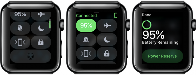
I don’t know if someone at Apple read my critique of the nonsensical navigation of the original watchOS. But in any case, the new watchOS straightens things out a lot. The side button no longer opens a useless screen of people to text or call. Instead, it offers a Dock: your most often-used apps. And you can swipe up from the bottom to get the Control Center—frequently changed settings.
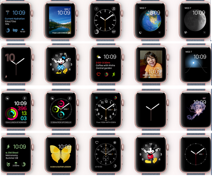
There are more watch faces, and you can switch among them just by swiping horizontally across the watch’s glass. (There used to be a setup step first.) There’s now a Minnie Mouse watch face, not just Mickey (gender equality at last!). Another new face shows your activity progress on the same screen as the time. And a third new face called Numerals makes the hour follow the hands around the face.
A new Breathe app guides you through (and, in fact, reminds you to do each day) a deep-breathing exercise—a trick to calming down that really works. It’s not, alas, timed to your breathing, the way the equivalent feature on the Fitbit Charge 2 is.

You can now share your physical activity graph (or heart rate) with family or friends—fitness through humiliation. Or shoot messages to each other, either written or spoken.
There’s fitness tracking for wheelchair users—a first.
You can label your workouts after you’ve completed them.
Much faster app launching. (Frequently opened apps are kept in memory.)
Swipe up from the bottom of the watch face to open the Control Center, a panel of important settings.
Reply options now appear on the same screen as incoming text messages. And one of them is Scribble, which is handwriting (well, fingertip) recognition. You can reply to a text message by writing on the watch face, letter by letter. That’s surprisingly useful.
There are new apps for Reminders and Find My Friends.
A new feature called SOS works like this: In an emergency, you can hold down the Side button to call 911 (after a three-second countdown), or whatever the local country’s equivalent number is. Then it notifies your emergency contacts, complete with a map of your location. Then the watch displays your medical ID.
Automatic login
Finally, watchOS offers the closest thing yet to what could be called a killer app: It can unlock your Mac just by being nearby. That is, when you wake your Mac, the usual password screen doesn’t appear—instead, the watch acts like a wireless master key. (For security, it has a very short range—a few feet.)
Once you’ve turned this feature on, just waking your Mac—raising the laptop lid, for example—logs you in, instantly and securely. In place of the usual password box on your Mac’s screen, it says “Unlocking with Apple Watch.” And your watch says “Mac Unlocked.” And you’re in.
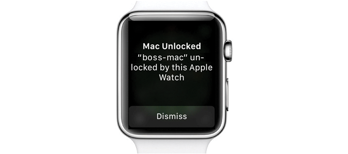
The requirements: The Mac has to be a 2013 or later model, running macOS Sierra. Watch and Mac must be associated with the same iCloud account. Watch and Mac must both be passcode-protected.
And—here’s the eyebrow-raising part—you must have two-factor authentication turned on. That’s Apple’s new security system for logging into things. (And no, smartypants. Two-factor authentication is not the same thing as last year’s two-step verification. Although they do have one thing in common: They both have terrible names.)
Unfortunately, Apple doesn’t let just anybody turn this feature on. They’re rolling it out slowly to a few people at a time. You’re supposed to turn it on in System Preferences-> Cloud-> Security -> Account Details, but you may just get a message that says something like, “Two-factor authentication is not available for your iCloud account.”
But once you do turn it on—hoo, boy. That is the ultimate. High security, no inconvenience. Nicely done.
Watch the watch
Let’s be clear: There are people who love their Apple Watches. They’re proud of their Apple Watches. They give it very high marks for satisfaction. So there’s that.
But this watch is still overloaded.
It’s still got way too many features. It’s still unfocused. It has, if you can believe it, 90 screens full of settings on the iPhone. For everything from vibration strength, to Buddhist calendars, to how you want your city abbreviated on the Weather screen, to something called Use Previous Duration (“When this is on, every new Breathe session will default to the duration of your previously completed session”).
That’s right, 90 screens. I counted.

And there are still way too many ways to interact with the watch. (Turn the crown, click the crown, double-click the crown, hold down the crown. Click the side button, double-click the side button, hold in the side button. Swipe across the screen up, down, left, right. Tap the screen, hard-press the screen.) And it’s too hard to remember which technique does what in which context.
This is the post-Steve Jobs Apple, where the plan for success is piling on as many features as possible, rather than knowing when to say “no.”
Someday, battery technology will improve enough to make smartwatches thinner and longer-lasting. Someday, designers will figure out how to make software easy to navigate on a 1.5-inch screen. Someday, a smartwatch will be a must-have for the masses.
Alas, the Apple Watch 2 isn’t it.
David Pogue, tech columnist for Yahoo Finance, welcomes non-toxic comments in the Comments below. On the Web, he’s davidpogue.com. On Twitter, he’s @pogue. On email, he’s [email protected]. Here’s how to get his columns by email.
