These gorgeous analog watches have a secret
Here’s what’s great about smartwatches and fitness watches: They put text messages and notifications right on your wrist. They motivate you to be healthier.
Here’s what’s not great about them: Their screens are blank until you lift your arm a certain way, they have terrible battery life, and they look nerdy.
Watchmakers have been turning wristwear into art for 100 years. Why couldn’t somebody put the same smarts into a gorgeous analog watch — with hour and minute hands — to give us the best of both worlds? Fitness tracking, notifications, and a phone app like a smartwatch; long battery life, good looks, and physical hands like an analog watch.
Somebody has. Actually, at least four somebodies. I’ve spent the last month strapping good-looking hybrid watches onto my arm: The Fossil Q Commuter, Mondaine Helvetica 1, Nokia Steel HR, and Garmin Vivomove HR.
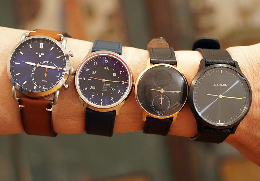
It’s kind of wonderful to be able to check the time anytime — say, when your hand’s motionless on the steering wheel — without having to make some weird wrist movement. It’s great that these watches set themselves when you change time zones. It’s fantastic to get compliments on your watch’s looks — which, trust me, doesn’t happen with most smartwatches.
Unfortunately, you sacrifice a lot of features along the way. Only one of these models is fully fitness featured.
Fossil Q Commuter ($95 to $175)
Fossil (FOSL) offers an enormous array of hybrid smarwatch/fashion watches. Or, rather, it’s the same watch over and over again, in different colors and styles. Me, I’m nuts about the Navy Leather (top right).

I should warn you, though: This is a big, chuncky watch (42 mm). It’s not for the faint of wrist.
You never have to recharge these watches. Each has a regular watch battery that lasts a year. A year! Take that, Apple (AAPL) “One-Day” Watch!
The Fossil is water-resistant enough to wear in the shower or while you’re swimming. It takes standard watchbands, too, so you can equip yours with whatever look you want.
But the Q Commuter has no screen. So how is it supposed to alert you of incoming texts and calls?
Well, it vibrates, of course. And if the call or text comes from one of your 12 favorite people (which you’ve set up in the phone app), the hands visibly, swiftly move to the corresponding number on the dial — something you’ve probably never seen before. Not ideal, but better than nothing.
There’s a smaller dial, called the subeye. The right half shows your current step count, expressed as a percentage of your daily goal. The left half — well, see below.
The watch has three buttons on the right edge. Using the app, you can program each of the buttons to do one of these cool things:
Remote shutter. Fire your phone’s camera by remote control. Handy selfies!
Control music. Play/Pause, Volume Up, or Volume Down.
Find your phone. Makes your phone beep from under the cushions.
Stopwatch. Both hands whirl into alignment and vibrate, the watch’s way of saying, “Press the button again to start ticking off stopwatch seconds!”
Show commute time. Shows, using the hands, how long it will take you to get to your office address (which you’ve specified in the app).
Show the date. The hands whirl to today’s date. (The numbers of the month appear in tiny digits around the edge of the dial.)
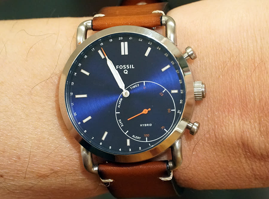
Last text. The hands suddenly point to one of the 12 numbers (which you’ve previously assigned to your favorite 12 people), identifying whoever texted you most recently.
Second time zone. The hands reveal the current time in a foreign city of your choice (you’ve set it up in the app).
Mode switch. The left half of the subeye has four quadrants: Alert, Date, Alarm, Time 2. If you assign a button to Mode Switch, then each press moves the subeye’s needle to one of those four spots. They correspond to the Last Text, Date, and Second Time Zone displays described above (plus Alarm, which shows whatever alarm time you’ve set in the app). That way, you don’t have to waste a whole button on one of those functions or another.
If programming all of those cool functions doesn’t release enough nerd endorphins in your brain, get this: You can even use the app to memorize combinations of three buttons. You might have a Music set, for example, where the three buttons are Volume Up, Volume Down, and Play/Pause. Using the app, you can switch sets with a tap.
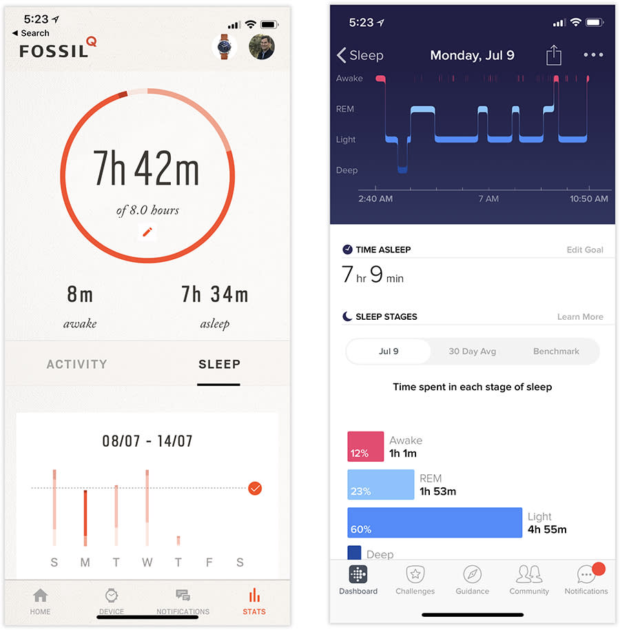
What about fitness? Here’s the tragedy: There’s no heart-rate monitor on this watch. As a result, its sleep and activity tracking aren’t nearly as accurate as, say, a Fitbit’s (FIT). In general, the step counting is OK, but the sleep tally is far too generous. As best as I can figure out, it counts time in bed as time asleep. So if you read or chat with your spouse before bed — or, conversely, read The New York Times when you wake up — the Fossil thinks you’re getting some pretty spectacular sleep.
Once you master its cryptic way of communicating, the Fossil Q is a gadget lover’s delight. Those spinning hands are so cool, and wow, do the designs look good.
On the other hand, the sleep counting is awful, and without a screen, the smartwatch stuff will always feel half-baked.
Nokia Steel HR ($220)
If this watch reminds you of the Withings Steel watch, you’re not mistaken; Nokia (NOK) bought Withings in in 2016 and replaced its name. The big news in this model is the addition of a heart-rate monitor.
The Steel HR checks off an awful lot of nice boxes:
Heart-rate monitoring. You see your pulse graphs in the phone app. (The watch checks your pulse only once every 10 minutes, except when you’re exercising.)
Waterproof down to 165 feet; it can record your swimming laps.
A screen! Yes, there’s a little tiny screen that shows your current fitness stats: Steps, calories, distance, heart rate, and alarm time (vibration alarms; the watch itself makes no sound). You move between those displays by pressing the button on the side. The screen lights up only when you tap the watch, or raise your wrist.

Really great battery life. You recharge it with a special USB cradle, but you can go 25 days on a charge — at that point, you can go 20 more days using it only as a watch and step counter, without the heart-rate monitor.
The sub-dial always shows you, at a glance, how far you’ve come toward your step count goal.
It automatically detects activity like walking, running, and swimming.
The watch is available in two sizes: 36 mm or 40 mm, neither of which is as huge as the Fossil. But weirdly, the two sizes offer different features:
The larger model owes its extra width to a silver bezel that offers minute notches; unfortunately, this model is available only with a black face and silver body.
The smaller model is available with a black or white face, in silver or gold aluminum.
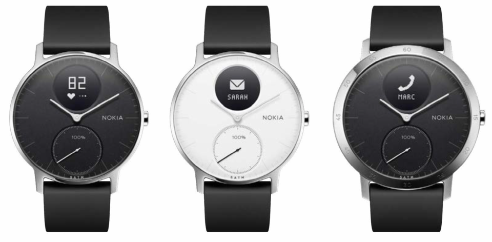
Each comes with a silicone band, although you can buy other bands from Nokia in various colors (leather, silicone, or woven cloth).
Sadly, you don’t see your actual text messages on that little screen (it’s too small) — only the name or number of the person who’s texted you. You still have to haul out your phone to read the note.
The fitness stuff is, well, not exactly Fitbit quality. The sleep tracking, in particular, seems way off (the watch takes a long time to notice that you’ve dozed off). And if you know anybody else with a Nokia fitness watch, you can add them to the app for friendly competition—a motivational trick that, on my Fitbit, really works. But how many people do you know with Nokia fitness watches? (Hint: None.)

But hey — did I mention that this watch is small and great-looking?
Mondaine Helvetica 1 Regular Smart Watch ($445)
Mondaine isn’t a gadget maker expanding its operations into watches. It’s the real deal: a true-blue, old-school Swiss watchmaker. (Well, 32 years old.)
Its Smart Watch is beautiful — at $445, it had better be. Its 40mm diameter strikes me as the perfect size. Its removable battery lasts for two years, and the watch is splash resistant (although not swimmable). The app, where you see your fitness and sleep stats, is quite beautiful, too.
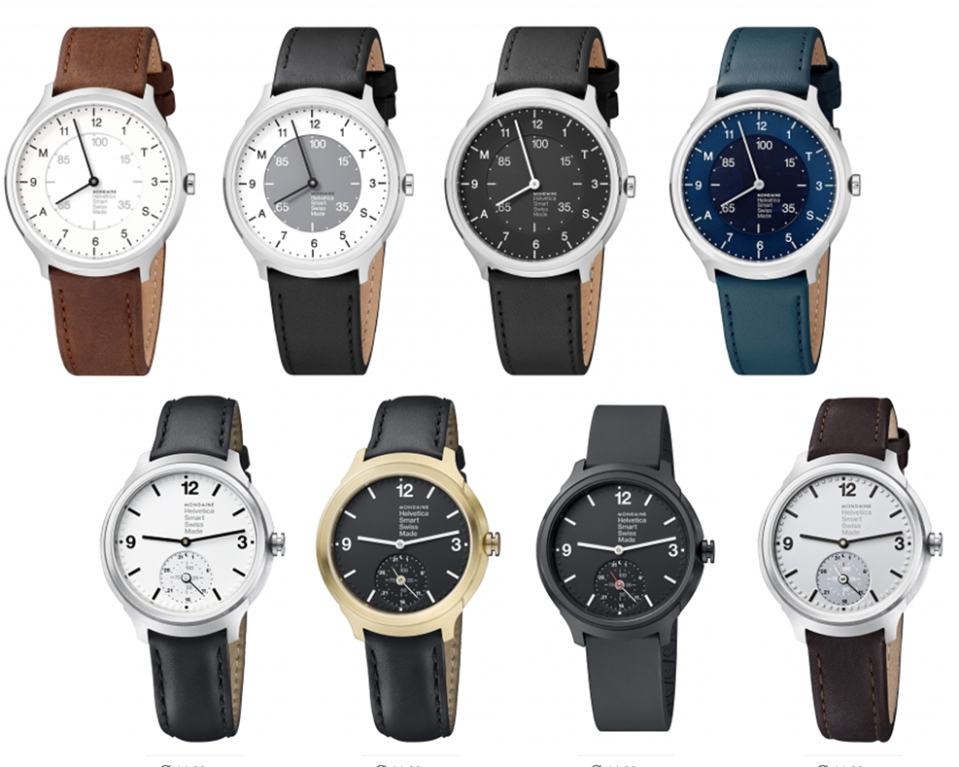
Actual digits appear at the 12, 3, 6, and 9 positions, and there’s an all-important push button on the edge.
Unfortunately, mastering that button’s functions is an exercise in cryptography. Only by memorizing the manual do you realize that you can:
Push once to see your step count so far. The minute hand magically moves to the letter A (where the 8 would usually be); the hour hand indicates, on an inner dial, your percentage progress. After two seconds, the hands glide back to the current time.
Push twice to show how much sleep you got last night. The minute hand moves to the letter S (where the 4 would usually be); the hour hand indicates, on an inner dial, your percentage progress.
Push three times to see the current time in another time zone (the hands move).
Hold in for three seconds when you go to bed, to begin sleep tracking.
The real problem with this watch is the notification system. When a text arrives, both hands spin to point at the letter M (at the 10:00 position on the dial); that’s your cue to check your phone for the actual message. When a call comes in, both hands spin to point at the letter T (at the 2:00 position on the dial).
In both cases, the hands stay there until you press the button.
Unfortunately, that’s a user-interface gaffe the size of Montana. You don’t always feel the vibration when a text arrives; therefore, the next time you glance at the watch to check the time, it’s stuck at 9:50. On my wrist, this watch seems to spend its life at 9:50. I mean, even a broken watch is right twice a day, but this watch seems broken about ten times a day.
You have to tell this watch manually that you’re going to sleep, something trackers haven’t required since 2010. There’s no heart-rate monitor, no screen, no community features, no activity detection … and, I’m sorry to report, no compelling reason to buy this watch.
Garmin Vivomove HR ($200)
This is an unbelievably complete, slickly engineered watch.
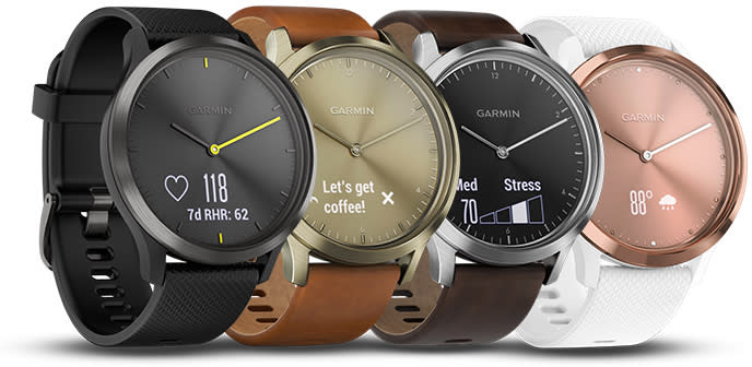
A screen is pretty much a necessity on a smartwatch—how else will you read your incoming texts? But the screen is also what makes a watch look nerdy. Garmin’s solution: a disappearing screen.
I’m not kidding. When you just want to know the time, your watch looks like it does here at left:
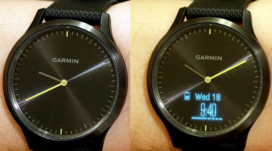
But when a text comes in, or you double-tap the glass, or you rotate your wrist, the screen lights up (above, right). Which means you can tell the time in the dark — which you can’t on the Fossil or Mondaine watches.
As though that’s not magical enough, it’s also a simple touchscreen. You can swipe repeatedly to see how many steps you’ve taken so far today, calories burned, distance walked, stairways climbed, active minutes, your current stress level (cool!), the current temp and weather forecast, music playback controls for your phone, and your notifications.
That’s a big one. The screen shows only a few words at a time, but at least you’re seeing the actual messages — not just a name (and not just a hand pointing to a number). You swipe across to see the remainder of your text messages, phone calls received, email subject lines, Facebook and Twitter posts, and so on. (You can’t respond from the watch.)
All of this is customizable; that is, you can choose which of these screens you want to see, and in which order.
The Vivomove is a full-blown fitness watch, and halfway along to being a smartwatch. The feature list is astounding. For example:
It has heart-rate monitoring.
You can swim with it.
It has a “you’ve been sitting too long” reminder.
It auto-records reps (when you’re lifting weights, for example).
It can alert you each time you’ve reached a certain workout milestone—a number of minutes, miles, or calories burned.
It can alert you whenever your heart rate drops below, or surges above, a limit you set.
It can display an estimate of your VO2 Max (maximum oxygen intake), which reflects your cardiorespiratory fitness.
You can challenge your Garmin-owning comrades to step-count competitions. (More people have Fitbits than Garmins, but more have Garmins than Nokias.)
There’s a stopwatch, countdown timer, and alarm clock.
There’s a music-playback control screen.
You can manually start and stop recording modes for walking, running, cardio, weights, and other exercise. All of this gets recorded on your phone and on your Garmin private webpage. (The watch auto-recognizes walking, running, cycling, swimming, and elliptical training once you’ve been doing it for at least 10 minutes—but for some reason, only walking and running get recorded in your list of activities.)
There’s a “Find my phone” feature.
There’s also a Do Not Disturb mode, so the screen will never light up and the watch won’t vibrate to get your attention.
You can adjust the screen brightness (it can get very bright), how long it stays on, and the vibration strength.
You can get the watch with either a silicone or leather band — but it uses standard watch straps, so you can dress it up with any band you like.
If you’re getting the idea that this is an incredibly complete, deeply feature-rich device, you’re right. And yet, incredibly, on your wrist, people see only a classic, simple analog fashion watch. All the digital stuff is completely hidden.
You will, however, pay three prices for all of this sophistication. First, a battery charge lasts only five days. (It recharges with a USB cable.)
Second, there’s a long learning curve. Mastering this thing involves tiny taps, swipes, and long presses.
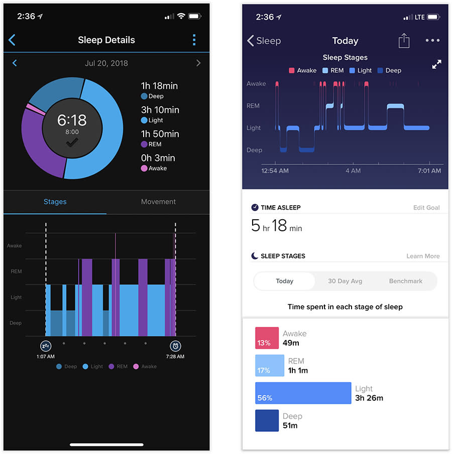
Finally, the Garmin once again seems too generous with its automatic sleep measurements. Compare it here to the Fitbit’s reading; the big difference seems to be how much time I lay awake. (Hint: The Fitbit’s report is closer to what I remember about this lousy night.)
The bottom line
It’s easy to love the Fossil Q Commuter for its wacky programmability, or the Nokia Steel HR for its subtlety and sweet size.
But if you want a fully featured fitness-tracking semi-smartwatch with the graceful, stylish looks of a handsome analog watch, the Garmin Vivomove HR is calling your wrist’s name.
David Pogue, tech columnist for Yahoo Finance, welcomes comments below. On the Web, he’s davidpogue.com. On Twitter, he’s @pogue. On email, he’s poguester@yahoo.com. You can sign up to get his stuff by email, here.
