The Windows 10 April 2018 Update: Terrible name, sweet upgrade
Microsoft (MSFT) has never been so great with Windows naming. Over the decades, it’s waffled between using version numbers (Windows 3, 7, 8, 10), year numbers (Windows 95, 98, 2000), and lofty nouns (Vista, Millennium, Creators).
Now there’s a new version, which might as well be called the No Brain Cells Left for Thinking Up Clever Names edition.
OK, OK. Its actual name is the Windows 10 April 2018 Update.
Well, as long as the company put its actual energy into making Windows 10 steadily better, I’m OK with that. And that’s exactly what the April 2018 Update shows. It’s a mass of random improvements, scattered all over its 50 million lines of code. Some, you’ll never even notice; some you’ll stumble on every few months; and some will bring you satisfaction every day.
None of it, I’m pleased to say, makes anything worse.
The Timeline
Windows 10 already had Task View: You click an icon on the taskbar (or press Windows key+Tab) to view miniatures of all your open windows. Just click or tap the window you want; Windows switches you instantly.
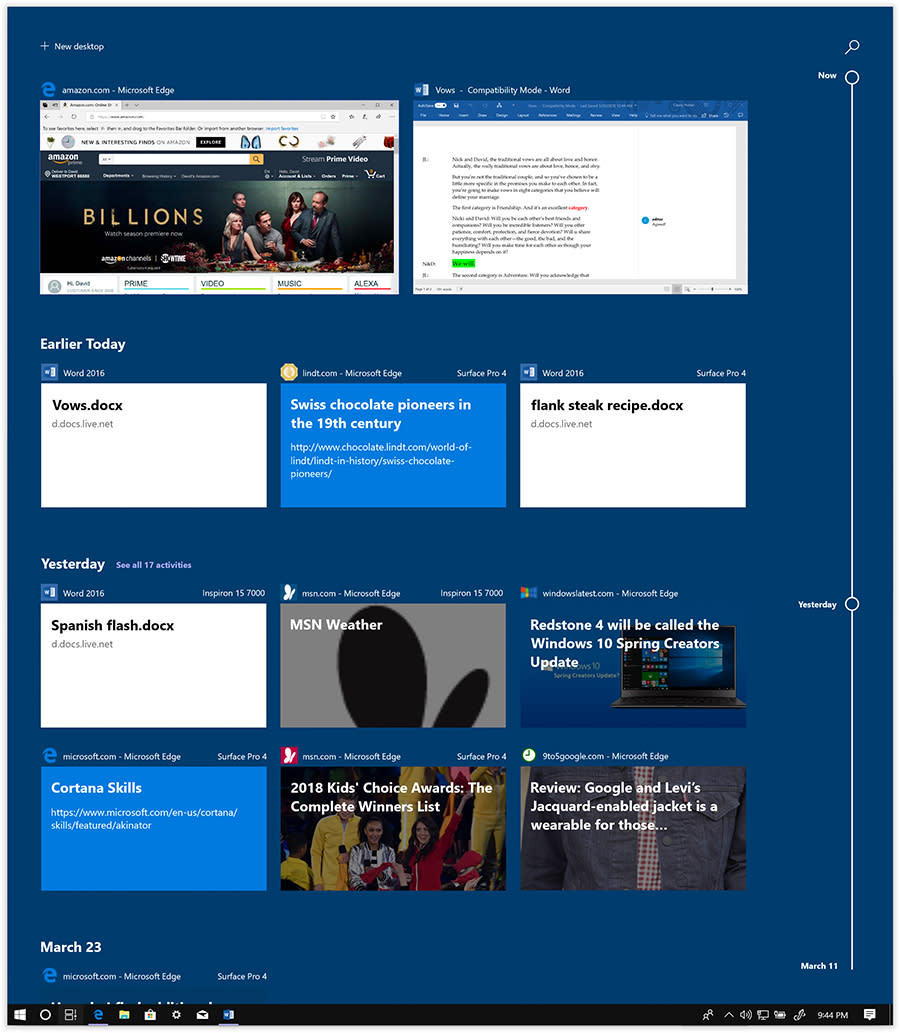
In the April 2018 Update, Task View gains a super power: the Timeline. Now, instead of showing you miniatures only for every window that’s open right now, it also lets you scroll down to see (or do a search for) every window you’ve had open in the past 30 days.
Even more amazingly, these window thumbnails include stuff you had open on other machines. Other Windows 10 PCs, sure, but even iPhones and Android phones running Microsoft apps (Office and the Edge browser). It’s incredibly cool.

The Timeline is an answer, at last, to the old questions, “Where did I put that?” and “Where did I see that?” Now it doesn’t matter. If you worked on it in the past month, you’ll find it here.
Well, mostly; unfortunately, apps have to be updated to work with Timeline. And at the outset, most of the Timeline-friendly programs come from Microsoft, like Word, Excel, PowerPoint, News, Sports, Money, Maps, Photos, and Edge (the browser). So for now, you’ll see cards for every website you’ve opened in Edge, but not in Chrome or Firefox.
You can remove individual cards, delete all cards from a certain day, or turn the feature off entirely (you people who share a PC with your spouse know you who are).
Focus Assist
There are times when you might prefer not to be interrupted, distracted, or awakened by the appearance (and sound) of Windows 10’s notification tiles. Maybe you’re about to give a presentation and don’t want embarrassing reminders showing up. Or maybe you’re going to bed; you don’t really want to be bothered with chirps for Facebook status updates and Twitter posts. You’d rather have that PC just collect them for the morning.

In Settings, you’ll actually discover two levels of Focus Assist (besides “Off”). Priority only means that some notifications are still allowed to pop up and get your attention. Which ones? That’s up to you. Click “Customize your priority list” to see the options. You might, for example, permit calls from your spouse, boss, and children to reach you; you certainly wouldn’t want Focus Assist to block somebody trying to tell you that there’s been an accident, that you’ve overslept, or that you’ve just won the lottery.
You can also designate certain apps’ notifications to get through. Maybe you’re a day trader, and you don’t want to miss a stock app’s alert that your portfolio is crashing. Or maybe you have some chat app whose pings you always want to answer. Use “Add an app” to set these up.
Alarms only is the more dramatic Focus Assist setting. It means that no notifications at all appear or make noise—except for alarms. Microsoft figures that if you set an alarm, you probably want it to go off, to prevent an oversleeping disaster.
You can also tell Windows 10 to turn on Focus Assist automatically under certain conditions: during certain hours of the day, when you’re playing a game, when you’re at home, or when you’re duplicating your screen (meaning, “When I’m giving an important presentation on a projector in front of 500 people and would rather not be humiliated by a text from my middle-schooler asking if I’ve seen her retainer”).
Edge browser
Microsoft continues to flesh out Edge, the web browser it introduced in 2015 to replace the ancient Internet Explorer. (I can still remember when Edge lacked such essential features as a History list, Downloads list, and an offline Reading list.)
Here’s what’s new:
Edge finally catches up to other browsers with the addition of a speaker icon on any tab that’s playing sound, so you can mute it with a click instead of hunting through your tabs to figure out what’s playing in the background.
At last, Microsoft’s browser can memorize your address and credit cards for autofill when you’re shopping online.
Edge is now Windows’s primary reading app for e-books and PDF documents. It gives these documents (and web pages, too, if you like) a full-screen, clutter-free layout, with font and background controls, and even a “read this aloud” button.
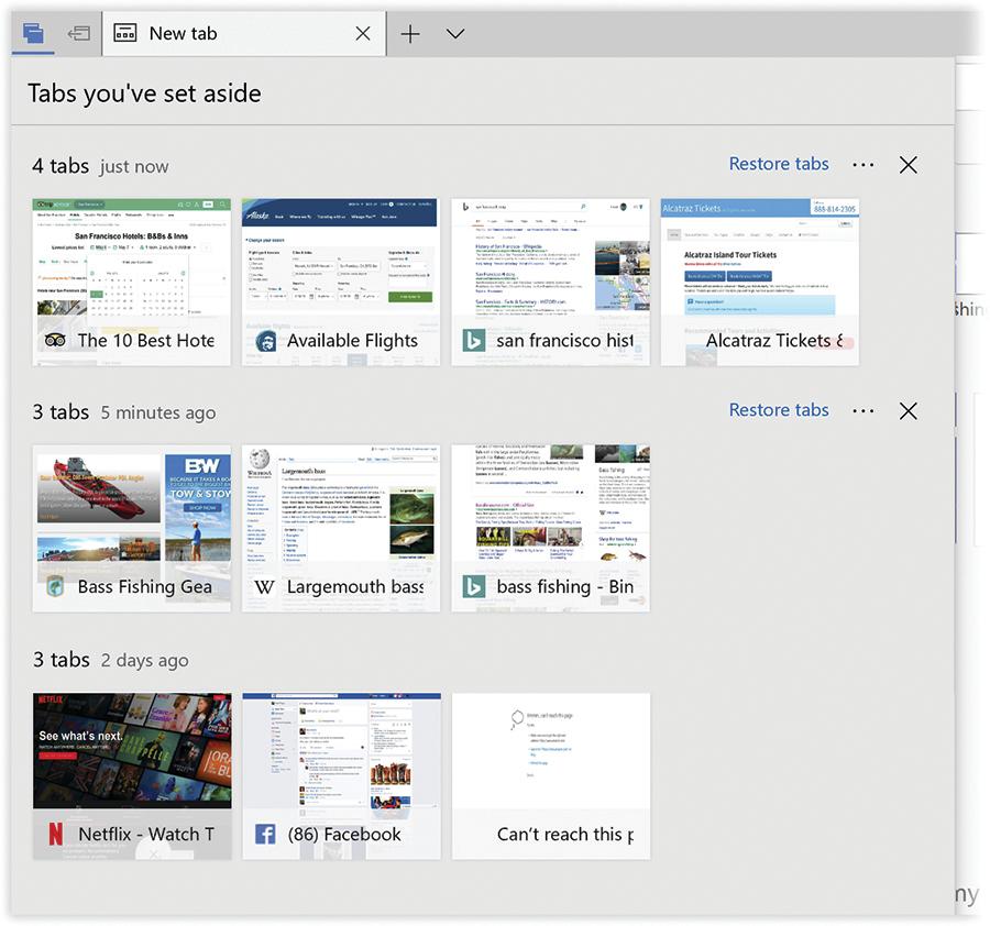
You’ve got a bunch tabs open—say, your research on a San Francisco trip. With one click on a new window icon, you can set those aside, all as a group. Another new window icon opens the panel where all of your set-aside tab groups await, ready to bring back en masse. I love this feature.

Nearby Sharing
Many of Windows 10’s recent enhancements have been clearly, ahem, inspired by features developed by Apple (AAPL). (Of course, Apple does plenty of stealing of its own.)
There’s that Focus Assist thing (like Apple’s Do Not Disturb). There’s Night Light, which makes screen colors warmer before bedtime to avoid disrupting sleepiness (like Apple’s Night Shift). And now there’s Nearby Sharing (like Apple’s AirDrop).
Nearby Sharing is designed to let you shoot files, photos, web pages, and other goodies to other machines nearby wirelessly, without messing with passwords, file sharing, networking, or setup. It’s infinitely superior to HomeGroup, Microsoft’s previous attempt at the casual file-sharing problem, which has now gone to the great feature bloat in the sky.
Alas, Nearby Sharing works only with other PCs running the April 2018 Update. And considering how long it takes companies and institutions to upgrade their copies of Windows, there won’t be many of those around for some time.
Settings grows
Remember the disaster that was Windows 8? Hope not.
It was, in essence, two operating systems superimposed. There was the regular desktop, which worked like regular Windows 7. And then, weirdly glued over it, there was a new, colorful environment made of tiles and modern typography that was designed for touchscreen tablets and laptops.
You therefore had to master two of everything. Two web browsers, two Control Panels, two mail programs, two ways of doing everything.
With Windows 10, Microsoft did a magnificent job of cleaning up that mess. Only one lingering tentacle of the double-headed Windows 8 remains: There are still two places to change your settings. There’s the old Control Panel, and there’s the new Settings app.
With every new release, Microsoft brings more settings into Settings, meaning there are fewer and fewer occasions to dig out the old Control Panel. In the April Update, for example, Settings gains the ability to manage fonts and adjust your keyboard and typing prefs.
The world very much looks forward to the day when Microsoft takes the old Control Panel out behind the barn and finishes it off. Maybe in, like, the August 2023 Update.
A lot of misc.
Here are a few of the tinier tweaks and polishings in the W10A2018U:
Voice control (via Cortana) of more smart-home devices, like Nest, Honeywell, and Ecobee thermostats.
Elaborate controls for auto-generated musical slideshows in Photos.

A keyboard shortcut (Windows key+H) for starting and stopping Windows’s speak-to-type feature. Dictation has always worked well, but few people use it—maybe this will help.
Here’s one for stylus+touchscreen owners: You can now handwrite anywhere you can type—for example, into text boxes, which auto-expand to give you room.
The Photos app lets you stamp 3-D objects or text onto your pictures, although it’s not clear how often you’ll want to do that.
Microsoft’s Groove Music service is dead. Instead, the company steers you to sign up for Spotify (SPOT) — and lets you ask for bands, songs, or playlists with voice commands.
The Game Bar, which lets you capture screen video, has more controls, like on/off buttons for your camera and microphone.
You can create folders for apps on the right side (the tiled side) of the Start menu.
The Emoji panel no longer closes after you’ve inserted a single emoji.
Lots of little updates to languages, handwriting, and touchscreen typing. For example, as you type, Windows can offer you three tappable autocomplete words, just as a smartphone does.
If the April 2018 sounds good to you, you can get it right now, or just wait until May 8, when Microsoft will start rolling it out automatically to anyone who has Windows 10. (A notification will invite you to install it.)
Microsoft hasn’t tried to characterize this update as, for example, the Spring Creators Update (which was its reputed name until just last week); there’s nothing themed about it. In a way, that’s reassuring. It means that Windows 10 has at last reached a uniform level of completeness without any glaring holes that urgently need addressing (and marketing).
Instead, Windows 10 remains the clean, attractive, responsive, coherently designed front end to your PC that it had already become—just with a little more April 2018.
David Pogue, tech columnist for Yahoo Finance, welcomes non-toxic comments in the Comments below. On the Web, he’s davidpogue.com. On Twitter, he’s @pogue. On email, he’s [email protected]. You can sign up to get his stuff by email, here.
More from David Pogue:
